The BRIMM
When your audience pivots, so should your brand.
The Project:
Blush Package + Retainer
The Brief:
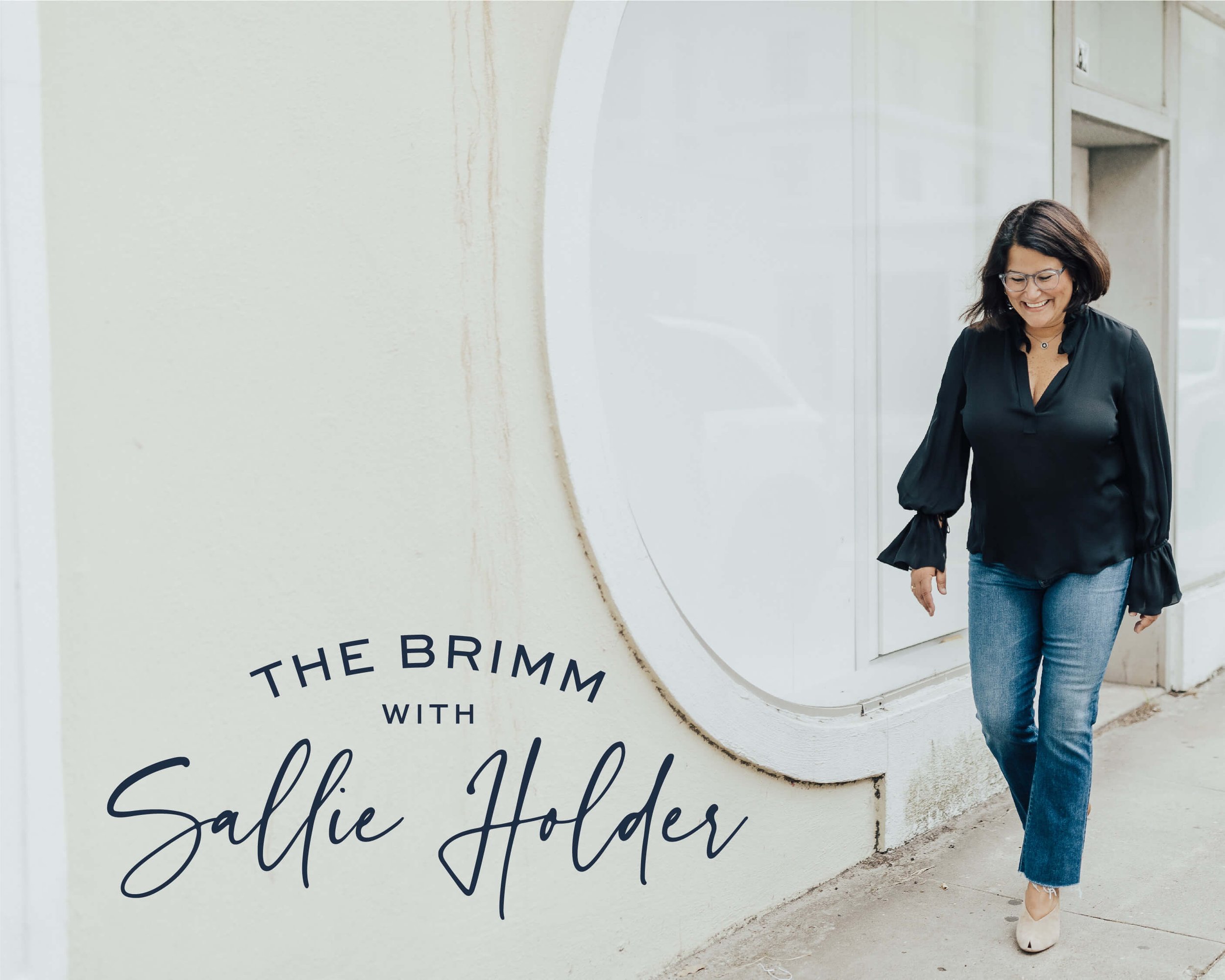
Our work with Sallie Holder, retainer client and owner of The BRIMM, took on a new form when she was ready to rebrand her business. As she pivoted from serving only female entrepreneurs to expanding her clientele to include men and women, she needed her brand to reflect this shift. Our objective was to create a brand that still felt like Sallie at the core, but that embraced attributes of the new clients she aimed to reach.
The Deliverables:
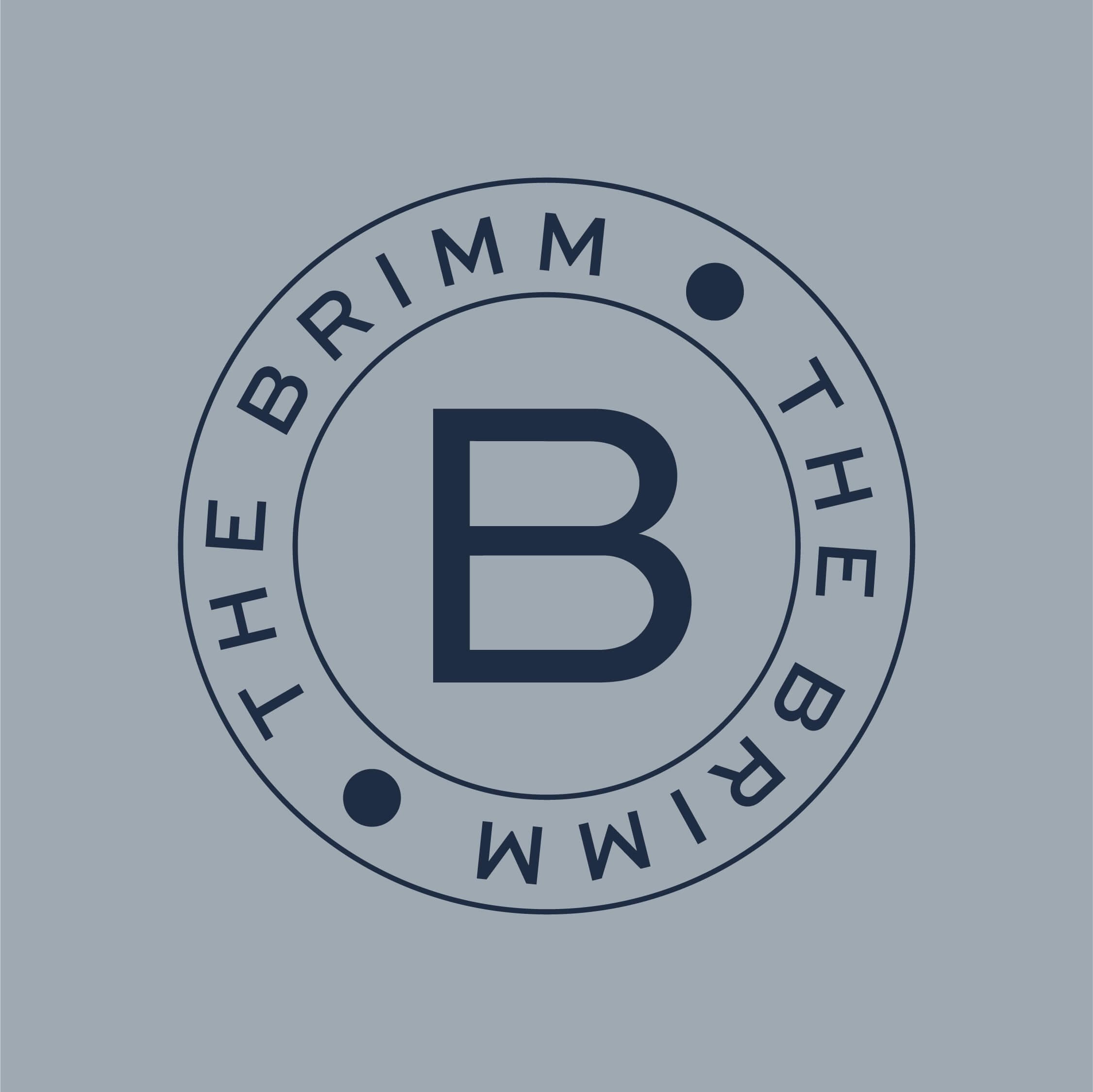
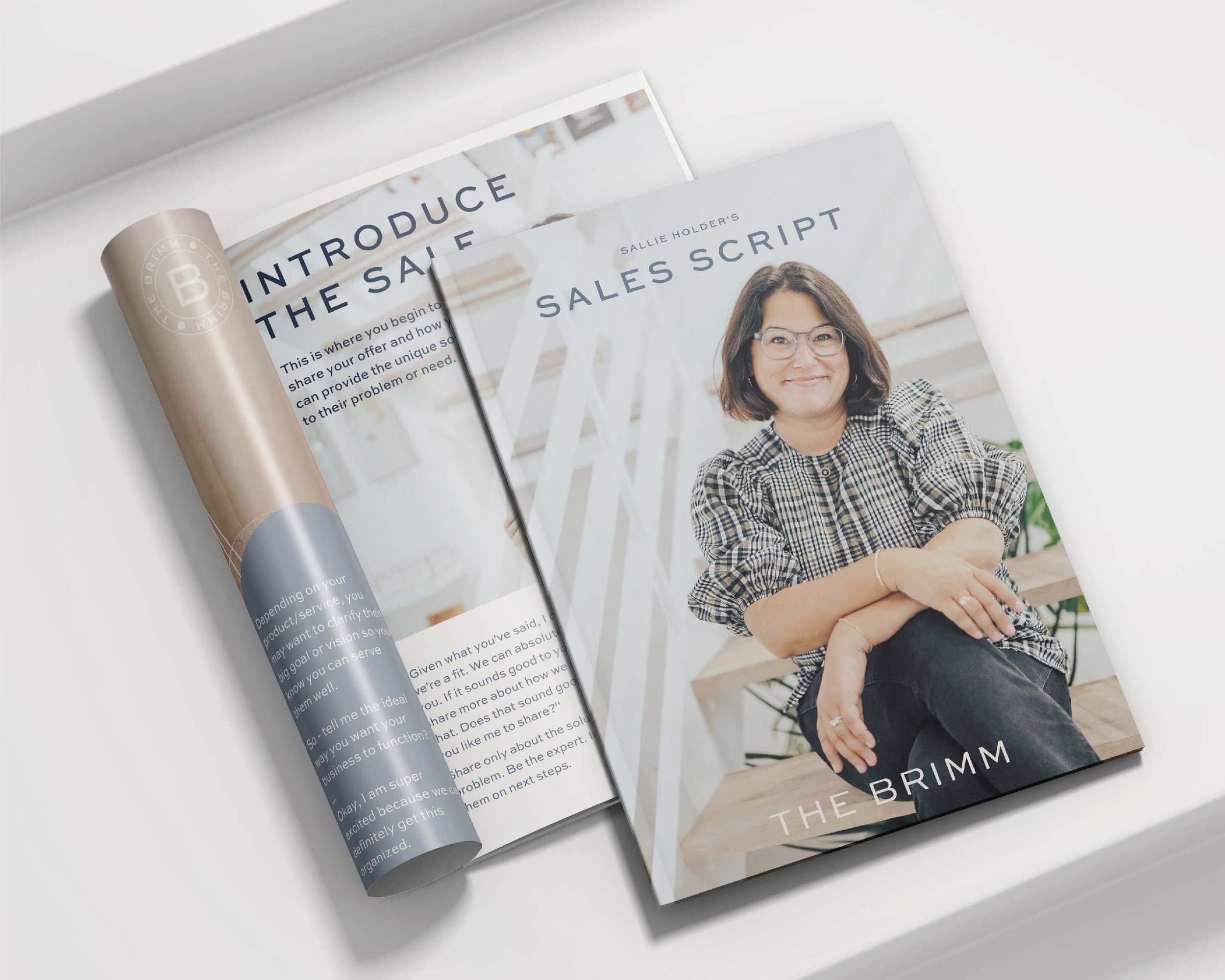
6 logo variations, extended brand guidelines
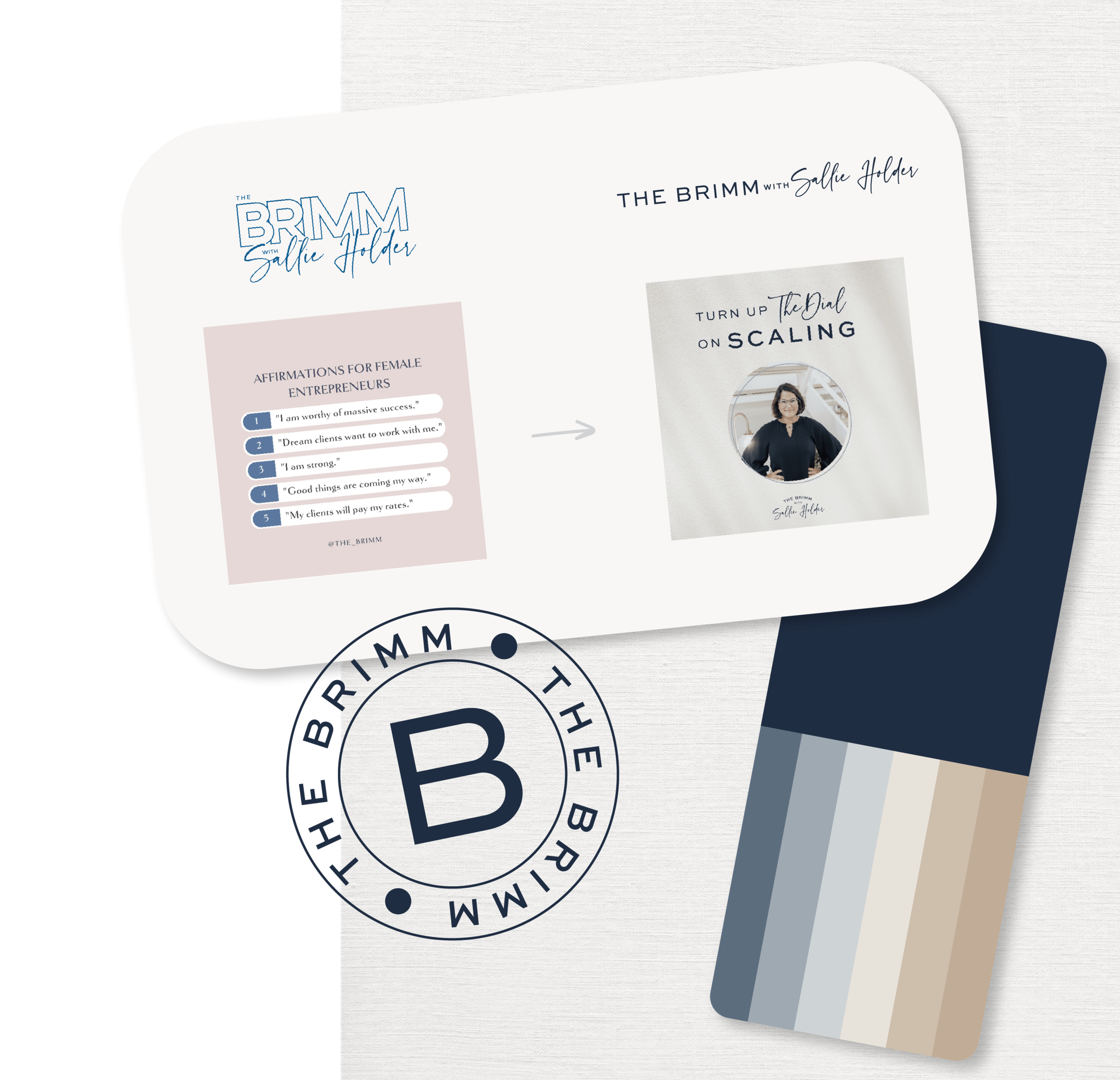
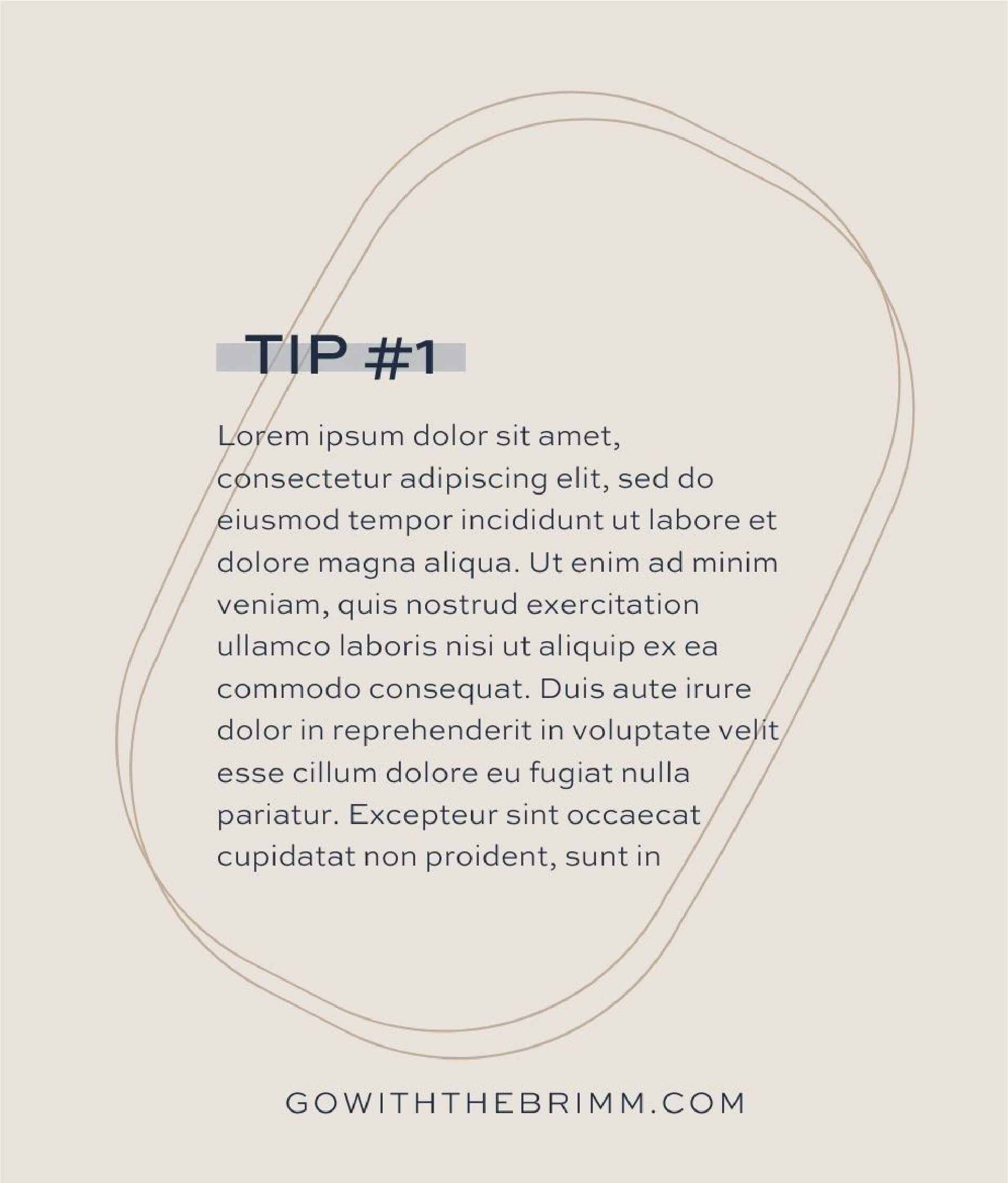
The strategic decisions of this rebrand revolved greatly around colors + fonts. In an effort to better reach her new audience, our team completely removed all pink tones and added in a neutral palette. Staying true to Sallie’s roots, we kept navy as her primary brand color, with a few adjustments to lower the intensity of its tone. The BRIMM’s logo was tweaked to include their new a sans serif font, and they were given many variations to use in different collateral. Sallie’s team opted to keep their current script font but use it more sparingly in their content.
Adding the final touches to their new branding, we accompanied the logos + fonts with shapes and lines to distinguish the The BRIMM’s style. Lastly, we determined the colors for a new brand shoot and built a library of neutral textures they can implement in their collateral.
Now, we get to enjoy watching this business thrive in their new element.